gpadmin
10 August, 2023

The graphs can be divided into 3 groups.
Each group has a different way of entering data.
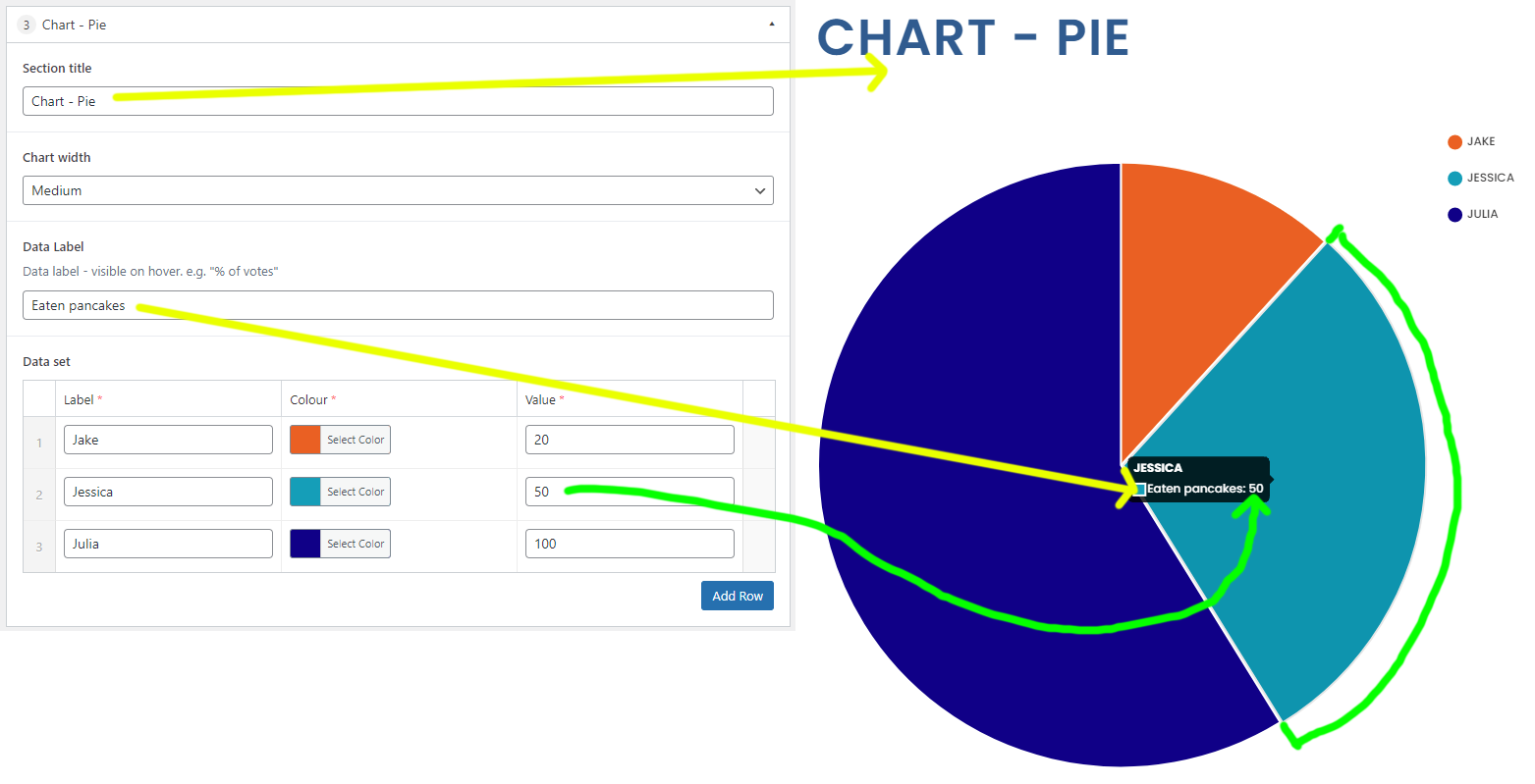
(Chart – Pie, Chart – Doughnut)
This type should be clear to understand.
The data label is displayed when hovering over a pie part.
Each data set is 1 part of the pie. Data set value has to be a number
(Chart – Bar, Chart – Line, Chart – Radar)
Bar:
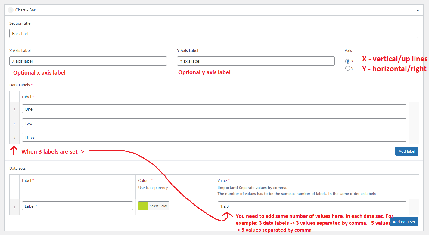
First value data set value (1) is assigned to first label (One), second value (2) to second label (Two) etc…
The most common way of adding data to a bar chart is to use multiple data labels and only 1 data set.
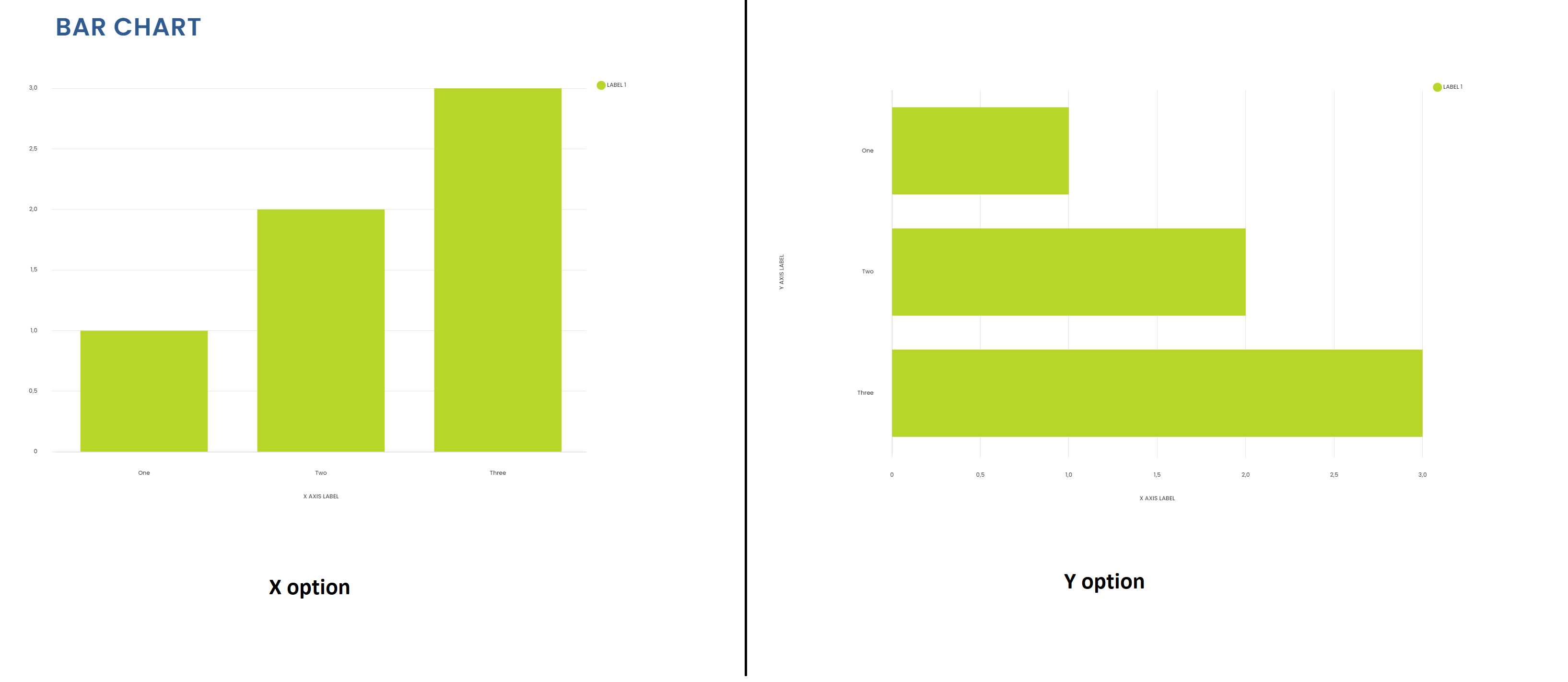
x/y axis option difference:
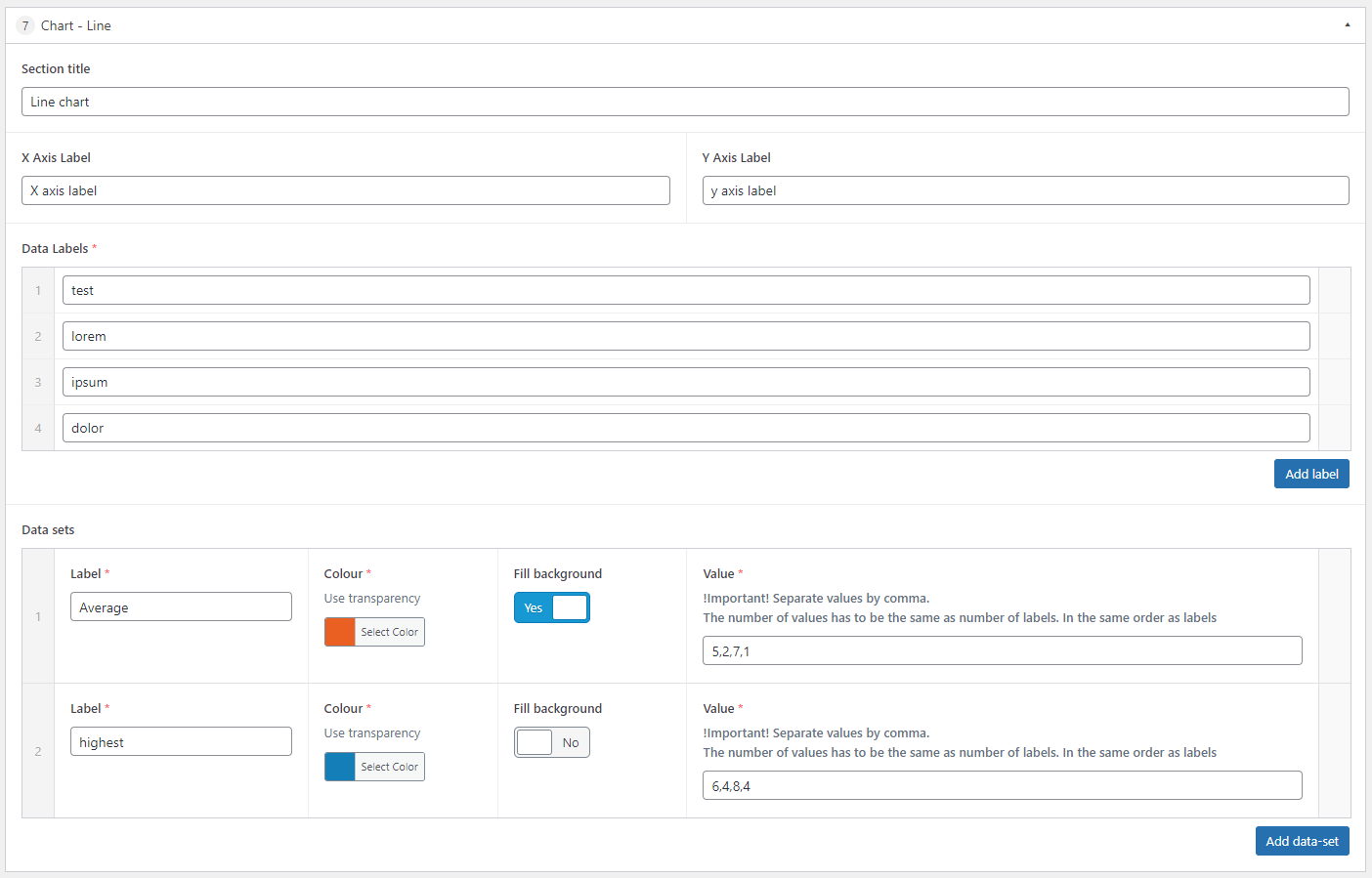
Line:
A line chart can be extended more than a bar chart. You can add multiple datasets. Each data set is a separate line (which can be filled in)
Data labels and data set values work the same as in a bar chart
Radar:
Data should be added in the same way as a line chart, but this chart requires a minimum of 3 data labels.
(Chart – Bubble)
This type is special. It can be configured in a few different ways.
The dataset title is not important here. More than 3 dots are recommended.
The easier setup is to add multiple dots in the same colour.
Each data set has an option to choose the colour.
After setting the colour, you can add dots in this dataset. Each dot will be the same colour. You can configure its size and position on the x and y axis.
You can add separate set of dots with different colours by adding another data set.
If you would like to have each dot in a different colour, then each data set should have only one dot.
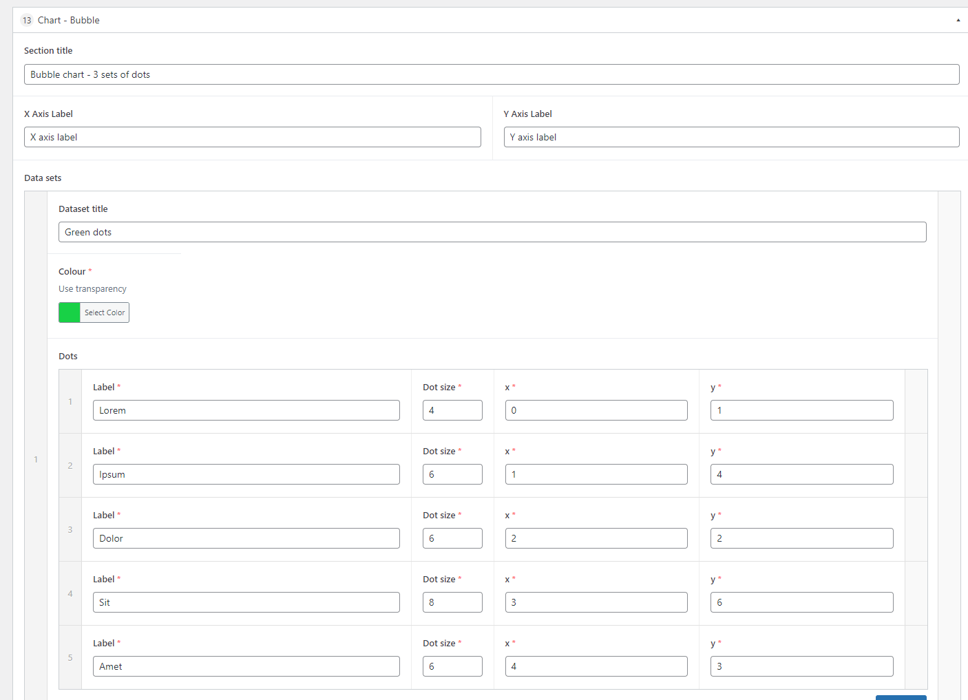
Examples below